I’m feeding a firewall and a domain controller into Graylog so I have tons of different fields.
I have a usability question. In 3.1.x in the “normal” search view I was entering the search and then did actions (like quick values) with the fields displayed on the left side. For example I was entering a full-text query for “conn_open” and the results were showing me all firewall logs with connection opening for the last five minutes by default. At the same time on the left side of the window the fields were reduced to fields available in the results and I could quickly pick one.
Now with 3.2.1 whatever search I do it always displays all fields on the left side. So I have to scroll a lot and even worse I can’t remember all of the field names so it’s a bit of a guessing until I find the right field.
Is there any configuration I can do to have back the 3.1 behaviour and only see fields that are part of the current search results?
In the past (Graylog 3.1.x) when I went into the fields on the left side only the ones from the current search results were displayed. So it took only seconds to find the right field.
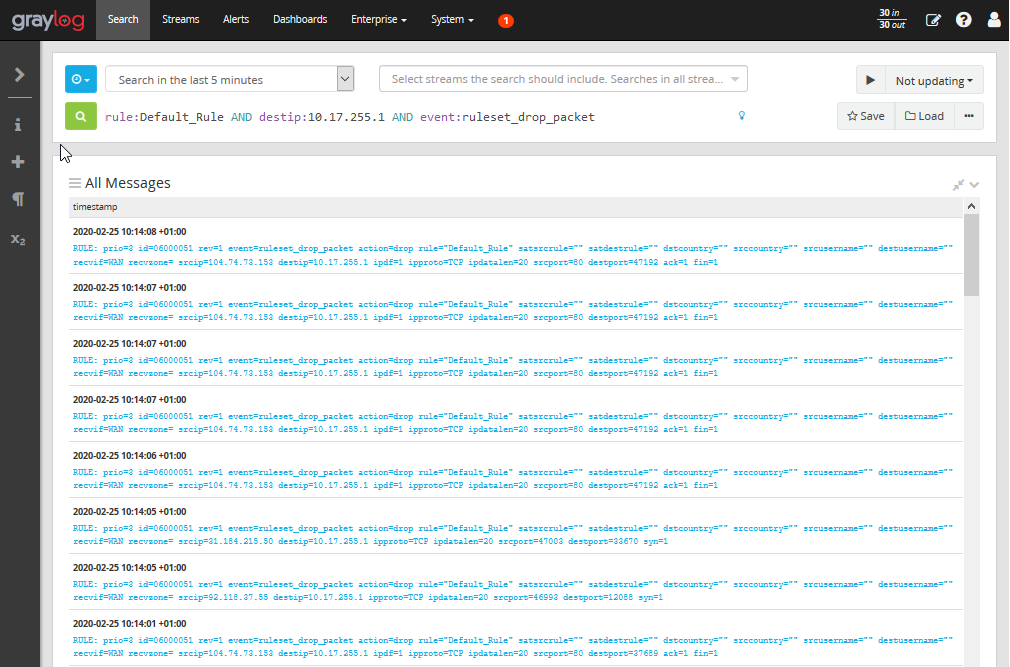
Now with Graylog 3.2.x I always see ALL fields like in this screenshot, even for the search in the example that gives very specific results:
So I have to scroll a LOT… And with this big amount of fields (produced by that firewall and domain controller windows logs) I’m struggling to find the right one on a quick search. Instead I always have to scroll through the list to find and select a suitable message and from there I select that field which is in my opinion far less intuitive and takes a lot more time.
Any chance to have this like in 3.1.x to only display the fields on the left side that are included in the current search results? I believe this was called “List fields of current page” where in 3.2.x I can only select “List fields of current streams”.
I have this problem also, can this be a preference to show the fields only shown on the results page rather than all fields from the index, as this clutters the view and reduces useability